
Blue paper was perceived as a typically Venetian medium. Iris Brahms uses drawings by the Carracci brothers to show the epistemic dimensions underlying the so-called carta azzurra and how it became an argument against Vasari’s doctrine.
Many innovations are associated with the Carracci family, including a painting reform that is said to have brought about the end of the Mannerism and the introduction of the Baroque style. With the founding of their academy in Bologna in 1582, which later bore the meaningful title Accademia degli Incamminati (“travelers on the path to the unattainable end of perfection” Gail Feigenbaum, “Practice in the Carracci Academy,” in The Artist’s Workshop, ed. Peter M. Lukehart (Washington, D.C.: National Gallery of Art, 1993), 59–76, 59.), they indeed pursued an ambitious program, which, among other things, declared the study of the nude to be an essential part of an artist’s training and thus attributed particular importance to verisimilitude and vivacitá. Albert Boesten-Stengel, Carracci-Studien. Studien zu Annibale und Agostino Carracci unter besonderer Berücksichtigung ihrer Zeichnungen (Torun: Univwersytetu Mikolaja Kopernika, 2008), 22, 106–116.
In this sense, their drawings on blue paper are an essential source to better understand the use of this specific medium in artistic practices as it also serves as material referring to the Venetian drawing tradition, which is crucial for their work to counter Giorgio Vasari’s Florence-Rome-focus.
Interestingly enough, they adhered to the established notion of following artistic precedents but were careful to make sure that neither the style of the predecessors nor a concise personal style became apparent. Although we have to understand the latter premise as a rather idealistic statement making collaborations better possible, such a desired shared style creates a dilemma when trying to make stylistic distinctions between the works of the brothers Agostino (1557–1602) and Annibale (1560–1609) as well as their cousin Ludovico (1555–1619), who continued to run the academy after the brothers had moved to Rome around 1595. Gail Feigenbaum, “Annibale in the Farnese Palace: A Classical Education,“ in The Drawings of Annibale Carracci (Washington, D.C.: National Gallery of Art, 1999), 108–120, 109.What this article focuses on, however, is the Carraccis’ use of blue paper to highlight its implications, which are integral to their new conception of art.
The aforementioned parameters of the Carraccis’ attitudes are exemplified, in a condensed form, in the outstanding frescoes for the Galleria of the Palazzo Farnese (1597–1601) in Rome. They undoubtedly represent the culmination of the collaboration between the two brothers, which was then soon dissolved after a dispute during this project. See Agucchi, Mancini and Bellori et al. in Boesten-Stengel, Carracci-Studien, 623–627.The frescoes were commissioned by Cardinal Odoardo, a member of the ducal house of Farnese that ruled in Parma and Piacenza, and enjoyed considerable international attention as part of the historic, venerable center of Italian art. Several references as to Michelangelo’s Sistine Chapel and Raphael’s frescoes in the Villa Farnesina opposite the Tiber are striking Diane De Grazia, ”The Inventive Genius of Annibale Carracci,” in The Drawings of Annibale Carracci (Washington, D.C.: National Gallery of Art, 1999), 14–22, 19., which were transferred into a new style that, while allowing the references to be recognized, conflates the relation to nature with a new awareness of the representation of beauty in the arts Denis Mahon, Studies in Seicento Art and Theory (London: The Warburg Institute, 1947), esp. 109–154.– as to observe in their drawings on blue paper. In 1620 respectively 1664/72, the theorists Giovanni Battista Agucchi and Giovanni Pietro Bellori attributed, in a neoplatonic fashion, “a high degree of historical authenticity and of internal coherence” Alfons Reckermann, Amor Mutuus. Annibale Carraccis Galleria-Farnese-Fresken und das Bild-Denken der Renaissance (Cologne/Vienna: Böhlau Verlag, 1991), 11–17, 17. [Translation by the author.]to the Carraccis’ concept, which is evident from their humanistic education as well as from their consultation of letterati (which has been a common practice at the time), in this case Fulvio Orsini.
Agostino and Annibale’s Cooperation in the Farnese Frescoes


With regard to the fresco depicting Acis and Galatea (fig. 1), located in the lower central part of the ceiling and set in an elaborate fictitious gold frame, a cartoon on blue paper in London (fig. 2) Gabriele Finaldi, Eric Harding and June Wallis, “The Conservation of the Carracci Cartoons in the National Gallery,” National Gallery Technical Bulletin 16 (1995), 30–46.and several figure studies Albert Boesten-Stengel, “Interventi reciproci o revalità nel progettare? La diversa partecipazione di Annibale e di Agostino Carracci alla Galleria Farnese secondo i disegni,” in La luce su Annibale Carracci, ed. Sybille Ebert-Schifferer and Silvia Ginzburg (Rom: De Luca Ed. d’Arte, 2011), 89–103.have been preserved, including those of Triton (shown on the right in fig. 1) in Los Angeles as well as New York (figs. 3, 4). While both the fresco and the cartoon were executed by Agostino, scholars disagree about the attribution of the Triton drawings. In summary Boesten-Stengel, Carracci-Studien, 24–26, 31, 38 et passim.This raises questions about the extent to which differences are regarded as variations of one hand or are levelled out under variations of a shared style, with the latter rendering attributions nearly impossible.


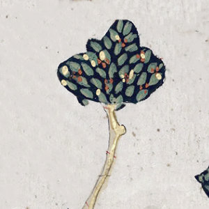
Fig. 4: Annibale Carracci (Italian, 1560–1609), Triton Blowing a Conch Shell (recto), about 1600. Black chalk on blue paper, 38.8 x 24.3 cm. New York, The Metropolitan Museum of Art, inv. 1970.15 © public domain
Both drawings are executed with black chalk on blue paper, the version in Los Angeles, however, is not easily recognizable as such because it has faded over time. Additionally, abrasion is another reason why the white highlights on the neck and upper arm, which were applied with chalk as well, are hardly visible anymore. At first glance, the blue could be seen as an anticipation of the fresco’s sky color, which constitutes the background of the Triton-figure. But this was by no means the only reason for the choice of this material: Because, traditionally, the blue paper has served less as a local color than as an abstract mid-tone from which both the shading and the light reflection can be modelled in quick steps; this practice favors an immediate depiction after life, especially when using chalks instead of a quill pen Iris Brahms, “Schnelligkeit als visuelle und taktile Erfahrung. Zum chiaroscuro in der venezianischen Zeichenpraxis,“ in Interdependenzen – Künste und künstlerische Techniken. 1430 – 1550, eds. Magdalena Bushart and Henrike Haug (Cologne/Weimar/Berlin: Böhlau Verlag, 2015), 205–229, pl. 28–30 with further literature.– a premise of the Carraccis’ concept. The artist of the L.A. sheet used this opportunity enabled by the blue paper brilliantly, since he was interested in the convincing depiction of the muscle power needed for the rotation and the resulting foreshortenings, which would not be comprehensible without a differentiated rilievo.
This was nothing less than an exploration of this drastic pose from the equally breathtaking vantage point, which, when compared to natural white paper, could be shown to an even greater extent in the contrasting of the black and white chalk against the blue paper, since the colored background inevitably suggests an atmospheric space around the figure.
However, such a drastic pose is not present in the New York sheet due to the frontal view, yet it similarly demonstrates the function of the blue paper both to emphasize the impression of a space that builds up around the figure and to provide the basis for modeling the figure in black chalk, in order to create different textures of skin, hair, and the conch shell, which is used as a flute. The difference in the line drawing – which is sweeping and concise in the L.A. drawing, while it is tentative and softer with regard to the less muscular figure in the New York version – only affects how much the figures stand out against an unspecific but atmospheric support that can easily be understood as air-filled space: the blue paper.
The Triton-drawings may also illustrate the enigmatic debate on attribution. Nicholas Turner, European Drawings. Catalogue of the Collections (Los Angeles, CA: The J. Paul Getty Museum, 2001), vol. 4, no. 12. Boesten-Stengel, Interventi, 90–91, fig. 3.To stay on the traditional path, both drawings show in all probability the spectrum of the same hand, namely that of Annibale, especially since they were drawn on the same sheet of paper, which was cut up at an unspecified time (fig. 5). George R. Goldner, European Drawings. 1. Catalogue of the Collections (Malibu, CA: The J. Paul Getty Museum, 1988), no. 9, ill. p. 39.Based on the disproportionately more muscular figure in the fresco, it seems plausible to recognize the L.A. drawing as a template by Annibale Cf. Annibale’s Male Nude Seen from Behind (c. 1593–1594) in Budapest (Szépmüvészeti Múzeum, inv. 1810, in exh. cat. Washington 1999, no. 26)., which, according to George Goldner and Gabriele Finaldi Gabriele Finaldi’s letter on 31 May 1995 to Nicholas Turner. With many thanks to Edina Adam and Michelle Sullivan for providing me with the curatorial object files., he himself has most likely resorted to in the painting by using another (not preserved) cartoon pricked for transfer, which probably had equipped the figure with more muscles, identical to the figure in the fresco. This allows us to understand the process of how Annibale modified the New York figure from Agostino’s cartoon in order to develop it further in his figure in Los Angeles. This modification is probably also the reason for the more tentative drawing style in New York, while Annibale in the L.A. sheet was able to draw the figure of Triton more freely from life. This is, indeed, a practice the Carraccis developed further to emphasize their challenge of persuading “vivacitá”: Even if they recognizably refer to figures of well-known artifacts, they do not integrate their postures without further study after life.

Compared to the Triton-figures, various drawings by Agostino on blue paper show a more sedate and linear style (figs. 6, 7): His Kneeling Nude (fig. 6) from the early period of the Bolognese Academy shows an impressively twisted upper body as well as muscles vividly emerging in black and white, which demonstrates once again the premise of a holistic understanding of extreme bodily movements. Not only does the blue paper enter as a mid-tone in the modelling of the muscles, as seen especially in the stretched arm in the foreground, but it also emphasizes the homogeneous effect in the relationship between the figure and its surrounding that has been adjusted by Agostino through the addition of cast shadows. Interestingly enough, these shadows do not follow only one light source but seem to explore diverse light effects. Even if the drawing was probably made in view of Paolo Veronese’s The Martyrdom of Saint Justina of Padua (c. 1570–75, Sta. Giustina, Padua) during one of Agostino’s stays in Venice between 1581/82 and 1585, I would like to go even further and regard the differences between Veronese and Agostino’s figure as significant enough to consider Agostino’s drawing to be a study after life; the stick-like tool the figure is holding in his hand is significant in this sense. Again, we see how implemented this approach is in the Carraccis’ œuvre. A holistic understanding of bodily movements could emerge from such studies after life, which is also expressed implicitly in Annibale’s marginalia (known as postille) of an edition of Vasari’s Vite published by the Giunti in 1568 in which he rejects excessive anatomy studies on the contrary. Henry Keazor, ‘Distruggere la maniera?’: die Carracci-Postille (Freiburg i.Br.: Rombach, 2002), 14–17, 89–97 et passim.


Fig. 7: Agostino Carracci (Italian, 1557–1602), Cupid Overpowering Pan (recto), about 1590. Black and white chalk on blue paper, 34.3 x 25.9 cm. Los Angeles, The J. Paul Getty Museum, inv. 95.GB.49 © public domain
Furthermore, the drawing with Cupid Overpowering Pan (fig. 7) is characteristic for Agostino; it is associated with the decorations in Bologna’s Palazzo Magnani, which all three Carraccis worked on in the early 1590s. Here, the energetic scene is expressed by means of both deft and concise lines, resulting in the figures’ movements relating to each other. It is striking, how the blue paper adds the impression of homogeneous lighting to the depiction and makes the figures stand out by constituting the basis for the shaping of the bodies.
Blue Paper Between Venice and Vasari
The use of blue paper for drawing dates back to the early 15th century and is first evidenced in sheets by artists from northern Italy and Florence. See Brahms, Schnelligkeit, 208–209.But it was not until the second half of the 15th century that carte azzurre became so well established among Venetian artists that it would subsequently become the hallmark of the Venetian art of drawing, while it was more common elsewhere to prime papers with color to achieve the mid-tone necessary for chiaroscuro. Iris Brahms, “La strada vera. Tintoretto’s Drawings on Carte Azzurre and Art Theory,” in Venice in Blue (Testi e fonti per la storia della grafica), eds. Alexa McCarthy, Laura Moretti and Paolo Sachet (Florence: Olschki, 2024 forthcoming); Iris Brahms, “Ecologies of Blue Paper. Dürer and Beyond,” in 21: Inquiries into Art, History, and the Visual 4 (2023), 603–638, URL: https://doi.org/10.11588/xxi.2023.4. Chalks were used more often on blue papers than on specially colored ground-papers, since it is generally considered to function as a synergetic drawing instrument on these papers, given that they usually have a coarser surface onto which the powdery texture of the chalks binds particularly well. Nevertheless, these papers were not explicitly produced for artists at that time but were of lower quality compared to white papers and therefore cheaper and commonly used as packaging material. Iris Brahms, “Textur, Transparenz und Täuschung. Blaue Papiere in Pastellen und Schriftquellen des 18. Jahrhunderts,“ Zeitschrift für Kunstgeschichte 1 (2023), 68–99 with further literature, URL: https://doi.org/10.1515/ZKG-2023-1006.
With regard to blue paper being an integral component of the Venetian art of drawing, it is obvious that Agostino resorted to the carta azzurra during his stays in Venice, just as it can be observed in other cases in which artists adapted the local customs for pragmatic reasons.
This is even evident in Vasari’s œuvre, who stayed in Venice from 1541 to 1542 at the invitation of his friend Pietro Aretino (1492–1556), and it consequently reveals two things: firstly, the exceptional prevalence of using blue paper for drawing in Venice. Prior to that, Vasari did not use this specific paper for his drawings Florian Härb, The Drawings of Giorgio Vasari (1511–1574) (Rome: Ugo Bozzi Editore 2015), 29–62, 191–208 et passim.and in the instances he did subsequently rely on blue paper, he only used black chalk for an initial sketch but drew primarily with pen and ink, then adding wash. Vasari’s drawings on blue paper are paradigmatic for an ideally balanced chiaroscuro developed from a mid-tone, which is provided by the colored substrate. This might have also caused Vasari’s exclusive mention of chiaroscuro-drawings in his Vite as executed with pen and brush, disregarding the high potential of chalks on colored manufactured papers to explore drastic postures from life. Giorgio Vasari, Le Vite de’ più eccellenti pittori, scultori e architettori nelle redazioni del 1550 e 1568, eds. Rosanna Bettarini and Paola Barocchi (Florence: Sansoni, 1966), 118.Secondly, Vasari’s use of blue paper conversely shows his dogmatism in the Vite, which he had developed – even though he knows better – far removed from artistic practice: Vasari acquired knowledge of local drawing practices on site in Venice and in doing so was in no way likely to have been made aware of the lack of ‚good disegno‘ there that he later postulated. Brahms, Schnelligkeit, 209–210.The latter also serves as Annibale’s main criticism of Vasari, which he formulated in the postille.
It was especially the artistic exchange during their travels that caused Annibale to question the Florence- or Rome-centrism postulated in Vasari’s Vite when he, on his study trip in 1580, first set off for Parma to study works by his idol Antonio da Correggio (1489–1534) before eventually joining his brother in Venice, where works by Titian (1488/90–1576) and Paolo Veronese (1528–1588) impressed him greatly. Feigenbaum, Farnese Palace, 109 refers to Annibale’s letters of the time.By now, at the latest, the seeds were sown to propagate a counter-position to Vasari’s doctrine, which is almost caustically reflected in Annibale’s postille. Keazor, Carracci-Postille, 66–70 et passim with further literature.Thus, the postille have to be consulted as a valuable source to better understand the Carraccis’ innovations in theory and practice. Based on this appreciation, various transcripts exist, which also prove that these commentaries referred to Vasari’s second book of the third part of his Vite and thus placed Venetian art, especially Titian’s, in a better light. Ms. B 4224, Biblioteca dell’Archiginnasio, Bologna. Vgl. Henry Keazor‚ Carracci-Postille, 51.Annibale also argued against Vasari in his own interest as he explains the merit of studying nature, which Vasari neglected in favor of studying ancient sculptures and older artistic models:
The ignorant Vasari does not realize that the old good masters drew their things from the living model, and he would rather that it was good to work from the second(-rate) things (which are the antiquities and the works of the preceding artists) than from the first(-rate) and important things, which are the things of living nature that one must always imitate. But he did not understand this art. Keazor‚ Carracci-Postille, 12–13: Vasari, p. 806, Z. 1 – Vita di Tiziano // “[L’]ignorante Vasari [n]on s’accorge che gl’[a]ntichi buoni maestri [h]anno cavate le cose [l]oro dal vivo, et vuol [p]iù tosto che sia buono [r]itrar dalle seconde cose [c]he son l’antiche, che [d]a le prime, è princi[p]alissime che sono le vive, le quali si debbono [s]empre immitare. [M]a costui non intese [q]uest’arte.“ [Translation by the author.]
At this point we have come full circle and, once again, realize the significance that the drawing of nudes as well as the study of the affections with a direct observation of gestural movement in living human beings have had within the Carraccis‘ œuvre. Equally important for their convincing representation was a harmonious modelling of light and shadow, which could be explored with chalk all the better on blue paper. What furthermore is crucial: For the process of drawing directly from works of art on site or from life, the practical and pre-colored blue papers were particularly well suited compared to the more fragile colored ground-sheets. Thus, on the one hand, this pragmatism may support the topos of Venetian speed initiated by Paolo Pino in Dialogo di Pittura (1548), on the other hand, it may allude to the special significance of the color blue in the lagoon city, since the blue of the sky is reflected in the water, making this color, which since antiquity has been assigned to the element of air, more present here than anywhere else. Paul Hills, Venetian Colour. Marble, Mosaic, Painting and Glass. 1250–1550 (New Haven/London: Yale University Press, 1999); Johann Wolfgang von Goethe, Goethe’s Travels in Italy, transl., London 1885, p. 75: 8 October 1786.
The Carraccis thus referred to a material that served their own concept, constituting an alternative to Vasari, and in doing so they used the blue paper to emphasize their claim to verisimilitude and a holistic understanding of bodily movements, especially since this material enabled them to represent spatiality and corporeality in an intensified way. At the same time, the Carracci mastered a method of using the material to reflect the imitation of nature through specific painterly means. This is not without an admiration of Venetian art and the Venetian style of drawing – for which blue paper stands for all.
Iris Brahms ist Kunsthistorikerin und arbeitet als Post-Doc am SFB 1391 „Andere Ästhetik“ an der Universität Tübingen.